Logo Design
James Hutchens has a Masters of Fine Arts with an emphasis on photography and graphic design, and has over 30 years experience creating logos and other digital media

Logo Design for your Company and Website
If you are just starting your company, you may already have a logo that was designed by your or your nephew. It might be an important step to evaluate just how effective that logo will be moving forward. The fact is, your company logo, not only needs to instantly create brand recognition for your company, but it also needs to be legible and discernable at many different scales.
This is something that many people forget. I used to tell my students at COCC that the more money a logo costs, the fewer colors and details will be in it. This ironic fact was just a funny way to introduce important concepts of logo design.
Basic Logo Design Concepts
Separate Graphic Element
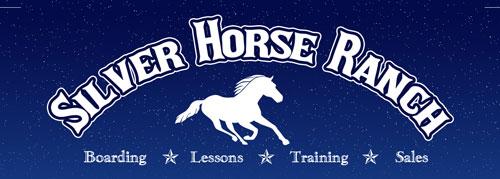
Having a separate graphic element will give you a lot of flexibility when presenting your logo on different platforms that have different requirements such as a square format. Think of the Target logo or the Apple logo which use a separate graphic element that is sometimes the only needed element to identify the company. If your company name is integrated into the graphics of the logo, then when the logo is rendered small, your company name may become unreadable.
Monochromatic
Monochromatic of course means “one color” and logos that are created in one color and don’t rely on color contrast for their effect can just as effectively be photocopied as black and white, be etched into glass, cut out of vinyl, etc. Whereas, if your logo has many colors and relies on the color contrast then it may fail when forced into a single color as in the above examples.
Simple Design
A very complex logo design will become intelligible when it is inevitably forced into a small format such as a profile icon of facebook, linkedin, etc. You’ll want the graphic element of your logo to be simple enough that at a small size, it’s still just as recognizable.
Unique and Interesting
There are many graphic techniques for making simple images and designs more interesting. Some of these utilize clever graphic design tricks such as figure ground, repetition, and more. Have you seen the “hidden” arrow in the FedEx logo? Have you seen how the cat and dog in the Petco logo define each other?


